Crash Block: A Bold Display Font for Digital Brand Impact
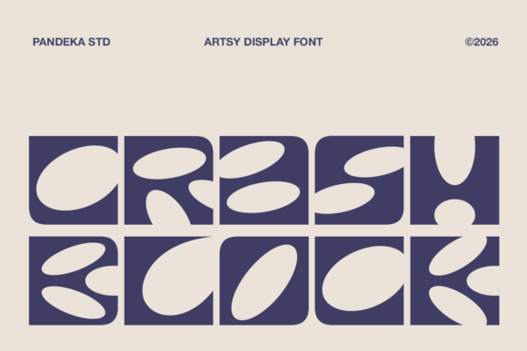
As a UI designer who ships landing pages, SaaS dashboards, and e-commerce experiences daily, I don’t reach for display fonts lightly. They’re not background players—they’re tone-setters, hierarchy anchors, and brand accelerants. Crash Block is one of the few decorative display fonts that delivers visual punch without sacrificing digital legibility or layout control. Built from chunky geometric shapes and intentionally asymmetrical letter constructions, it’s modular, playful, and unmistakably artsy—yet engineered to hold up in real web contexts.
What makes Crash Block work so well on screen isn’t just its aesthetic—it’s how its weight distribution and generous x-height support fast scanning at larger sizes. On a hero section, it commands attention without crowding. On a mobile banner, its clean negative space prevents blurring or pixelation even at 48px on high-DPI displays. Unlike many experimental typefaces, Crash Block avoids excessive ligatures or unpredictable spacing traps—so your CSS text-rendering declarations behave predictably, and your line-height ratios stay stable across breakpoints.
Use it where you need instant tonal clarity: product launch headlines, course title cards, boutique shop banners, portfolio project labels, or branded CTA buttons. It shines strongest at 36–96px on desktop and 28–64px on mobile—ideal for hero titles, section headers, and short action phrases like “Join Now” or “Limited Edition.” Avoid using it for body copy, navigation menus, or form labels. Its strength lies in contrast: let Crash Block set the mood, then pair it with a neutral sans serif (like Inter, Manrope, or a system font stack) for all supporting text. That pairing creates rhythm, improves scannability, and reinforces professionalism—even when the brand voice is intentionally bold or irreverent.
For creative entrepreneurs and digital product teams, Crash Block supports consistent brand identity across touchpoints. A coaching site might use it for headline variants (“Your Breakthrough Starts Here”) while keeping testimonials and pricing tables in a highly readable sans serif. An online art supply store could deploy Crash Block in product category banners (“Handmade Papers,” “Ink Studio”)—then switch to a warm serif (like Cormorant Garamond) for blog posts about technique and craft. The font’s modular construction also lends itself well to animated reveals, subtle hover scaling, or SVG-based logo treatments—especially when exported as WOFF2 for optimal web performance.
Readability stays strong across environments—but context matters. On light backgrounds, Crash Block’s thick strokes read crisply at all supported sizes. On dark mode or image overlays, ensure at least 4.5:1 contrast (test with browser dev tools). For buttons, stick to uppercase short phrases (≤3 words) and add 8–12px letter-spacing to prevent visual clumping. Avoid tight tracking on mobile; increase spacing by 0.05em on viewports under 768px. And never stretch or skew the font—it’s designed to breathe in its native proportions.
Crash Block is delivered as a web-optimized display font family with multiple weights (Light, Regular, Bold), stylistic alternates (including angular and rounded terminals), and extended Latin character support. It includes OpenType features like case-sensitive forms and discretionary ligatures—handy for customizing logo lockups or social media graphics. All files are available in WOFF2 (primary), WOFF, and TTF formats, making integration into modern build pipelines straightforward. If your project requires multilingual support beyond Western European languages, verify coverage before purchase—some alternate glyphs may be limited.
Font pairing is where Crash Block earns its keep in production workflows. Pair it with a humanist sans serif for tech or education brands (e.g., Crash Block Bold + Nunito Sans), or go editorial with a refined serif (e.g., Crash Block Regular + Lora) for creative agencies or publishing platforms. Avoid competing display fonts—no script, no handwritten, no ultra-thin serifs—as they dilute hierarchy and create visual noise. Stick to one display font per project unless intentional contrast is part of the design system (e.g., Crash Block for headlines + a monospace for code snippets).
Licensing is non-negotiable in client and commercial work. Crash Block is a premium font—and its license explicitly covers web embedding, SaaS applications, online stores, digital templates, and branded assets like email headers or social ad creatives. Make sure your plan includes unlimited domains or project-based coverage, especially if you’re a freelance designer delivering sites for multiple clients. Self-hosted webfont files require proper CORS headers, and CDN delivery should include subdomain whitelisting. Never load it via third-party font services that don’t guarantee uptime or version control—your brand’s visual consistency depends on reliable delivery.
In practice, Crash Block works hardest when used with restraint. A fintech startup wouldn’t use it for a dashboard header—but their annual report landing page? Absolutely. A wellness brand might skip it for app navigation but deploy it powerfully in their “Retreat 2025” campaign banner. It’s not about being everywhere. It’s about being unforgettable where it counts: the first 3 seconds of user attention, the emotional hook before the scroll, the typographic signature that says, “This isn’t generic.” That’s where display fonts earn their place—not as decoration, but as functional brand infrastructure.
If your next project needs to stand out in a feed, convert faster on a squeeze page, or reflect a fearless creative identity, Crash Block isn’t just an option—it’s a strategic typography choice. It bridges artistic expression and digital utility without compromise. And in today’s crowded interface landscape, that balance is rare, valuable, and worth every pixel.